U Ethical
Reframing the future through ethical investing
UCA Funds Management (UCAFM) is the oldest ethical fund manager in Australia. Its history is rooted in the Uniting Church, with profits going back to social impact projects. In 2018 UCAFM set an ambitious growth objective which would require it to look beyond its current church-affiliated client base.
With most secular audiences having no knowledge of UCAFM, our brief was to develop a new brand that would resonate with a wider community of ethically-minded charities and institutions. The challenge was to create a fresh identity while ensuring that the organisation continued to embrace its values and heritage – bringing its loyal clients along on the journey.
The solution
The rebranding process began with the challenge of finding a new name for UCAFM. We spoke with board members, loyal clients, church members and potential investors to uncover the company’s unique benefits. From these insights we devised a brand strategy positioning it as progressive, professional and principled, but also as a compassionate ambassador for good in the corporate world.
We explored a number of options, brainstorming over 100 new names. The ultimate choice, ‘U Ethical’ represented the new brand perfectly. The word ‘ethical’ reflected UCAFM’s church heritage and the initial ‘U’ was a strong symbol of unity.
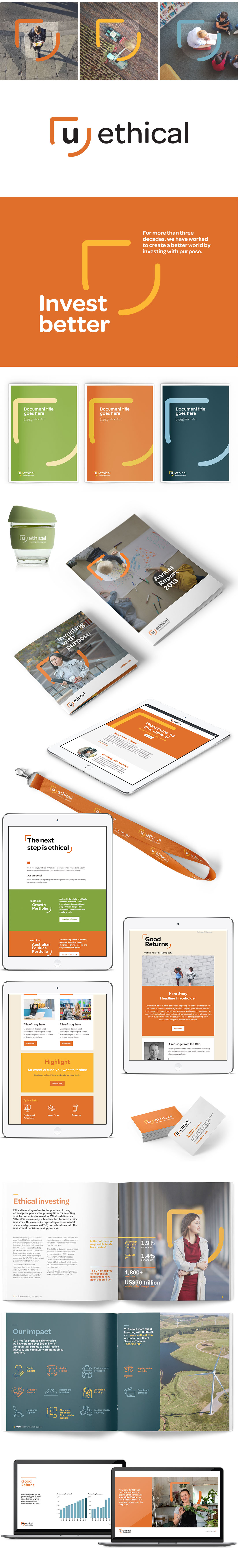
Our next step was to develop a visual identity that would strongly communicate U Ethical’s brand strategy. We developed a visual language based on the idea of ‘reframing the future’. The logo design, inspired by a view-finding mechanism, symbolises U Ethical’s vision of a better future, and its unique screening process which allows it to seek out appropriate investments. Moreover, with a warm colour scheme, rounded lines and bold photography, the new identity creates a warm and positive brand that helps to inspire action.
The result
The new brand has repositioned U Ethical as a market-leading ethical investment fund engaged in purposeful, successful investing. The branding has been rolled out across all customer touch points, from introductory emails through to fund performance reports, with the iconic ‘u frame’ visually connecting each piece.